Saturday, December 25, 2010

Christmas: East and West


Samadhi Series:  I See the Emerald Buddha for the First Time (detail)
In September, I went to Thailand for the first time. On the first day when the Dean and her husband took me to the Grand Palace in Bangkok, I saw the Emerald Buddha in the temple.  The Emerald Buddha is so beautiful.  It is set up high on an altar, high above worshippers and admirers. I cannot capture the beauty and the feeling of experiencing the Emerald Buddha.  So I think of Buddhist philosophy.  The title “Samadhi” refers to the state of enlightenment. It is explained this way:  “Neti! Neti! It is not this!  It is not this!” In the book Light of Yoga the author says that this state of enlightenment can only be expressed by profound silence.  I felt complete silence and joy in the presence of the Emerald Buddha.  This painting for the exhibition in Viet Nam is the first time I try to express my feeling about the Emerald Buddha.  I put him closer to us, looking serenely at us and also not looking at us, the state of enlightmenet is devoid of ego. I looked at this painting every day I worked on it of this exhibition. It is not good enough at all.  I think in my whole life I cannot express the quality of the Emerald Buddha.

Wednesday, December 1, 2010

See This Exhibit in Chicago: The Gray Collection: Seven Centuries of Art

Able to distill light and shadow, pre-camera, they came, they saw, they drew.  The Gray Collection: Seven Centuries of Art, Art Institute of Chicago, is a must-see exhibition of masterworks for serious artists and especially valuable for watercolorists and any artist who loves to make work on paper. The exhibit began September 25 and runs through January 2, 2011.

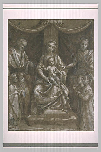
When you first walk into the exhibition, a large-scale ink drawing on paper by Bernardino Lanino comprised of six sheets joined together hits you.  It is Mother and Child, Warrior Saint and Group of Worshippers, 1563/70.  The drawing is tender and magnificent; the touch of the pencil delicate, making it clear Bernardino studied Leonardo DaVinci carefully.  Brown, black, and white ink on blue-green paper give this a mystical feel.

First corridor to the left: you should look for the Ubaldo Gandolfini’s Flagellation of Christ, a sepia pen and wash drawing, from the early 1700’s.  The red chalk and evidence of scale precision make this worth studying. There is a powerful, tender, youthful, Guercino of St. John the Baptist seated by a spring, 1652. The extravagant and original Salvador Rosa is represented by free, abstract brushwork to animate the subject by raising of Lazarus.  It is early 1600’s, pen and iron-gall ink with a red chalk under-drawing.  Canaletto Riva Degli Schrivon’s, Venice by St. Marks Sq, 1755, is seen from the market at the Pier. Pen and iron-gall ink contrast with the beautiful gray wash, reminiscent of the English method.  Anyone who loves Venice will note the two famous columns of St. Theodore seen up close and St. Marks’ winged Lion on right and Palazzo Ducale squarely on the left. In a time before contemporary tourists, St. Marks is seen alive with Venetians at work.  A delicate Guradi Lagoon and his study of 1780’s view of San Campo Zampolo, both scenes of Venice, balance light and shade.  They are drawn impeccably and there is no need for strong contrast.

A fascinating work of Tiepolo, Democritus and Heraclitus Laughing and Sorrowing over the Follies of the World, 1742/43, commands much thought. Tiepolo made a large number of drawings, besides paintings and frescos for which he is famous. This work on paper, considered one of Tiepolo’s most monumental and enigmatic pen and ink composition - with Democritus holding his compass and globe in a world that is resting in the dry Earth.  An animal and human skull litter the earth. A serpent coils on a staff; Heraclitus leans over Democritus’ shoulder to participate on the evaluation of the world’s folly.

In the Gray Collection, the 19th century is superbly represented as well: Gericault, David. Ingres, Cezanne, Daumier, Delacroix, Degas, De Chavannes and Seurat give anyone an art history lesson.  
I was especially taken by a remarkable Odilon Redon, a black charcoal and chalk drawing Primitive Being, 1867. This drawing features the David and Goliath theme with a naked 'primative being' contemplating the enormous decapitated head of a giant on the ground.  This was part of Redon’s ‘noir’ series of mid 1880’s. We all think of Seurat and his Sunday Afternoon masterpiece painting.  Don’t overlook his stunning landscape revealing his segmented synthesis of form and tone. Vuillard’s In the Salon 1899/1903 used longer, structured brushwork than other of Vuillard’s interiors.  Featured is a gem of a Cezanne, his small portrait of Madame Cezanne, 1833/85.

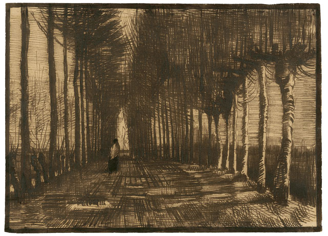
A beautiful Van Gogh landscape is his Avenue of Pollard Birches and Poplars, March 1884. This masterful ink drawing was inspired by the poem Tristement (Sadly) by François Coppie, describing a mourning widow. Here she walks away for us between tall narrow plane trees. Van Gogh used reed pen with his signature stunning intensity of pen-work using iron gall ink on tan laid paper. Ingres' work is stunning in any media, so enjoy a pen and ink wash drawing, Borghese Chapel, 1824 or a careful line portrait of Countess de Castellane 1834. Be surprised by occasional sculptures in the Gray Collection: Rodin’s bronze St. John the Baptist Preaching, 1878, rounds out the 19th century room.

Next, the 20th century:  first, an abstract and delicate Hans Arp bronze, Mediterranean Group 1941-42.  Giacometti’s oil portrait of G. David Thompson, shows a touch of tenderness in the face, was created in 1955. Thompson was a Pittsburg industrialist who was Giacometti’s largest collector at the time.There are other 20th century titans: Le Corbusier, Klee, Matisse, Rodchenko, Leger, Kandinsky, Schwitters, and Gris. A huge delightfully muted Miro collage of tan and brown paper with black conte and touches of white gouache and pen shows his relaxed confidence.  Miro makes buoyant cut forms, and linear astronomical elements in black ink. In my opinion, the show also contains a rare Miro work on paper with ink/ wash, collage, watercolor, black chalk and transfer decals of butterflies, a moth, humming bird. The recognizable shapes of grapes, cherries, and lime decals were handled in the same superior compositional bravura as his free-form and lines caprices.

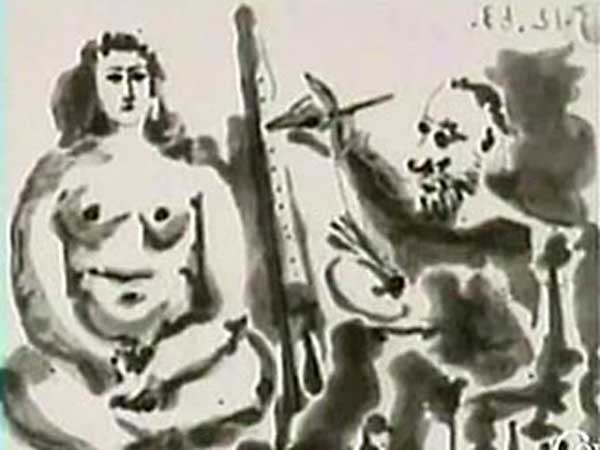
There is a fabulous Picasso 1933 Artist and Model watercolor and pen and black ink.  It is commanding, having no traces of under-drawing.  All Picasso’s works are exquisite and represent variations periods of his oeuvre. His colleague Juan Gris is represented by La Carte- Lettre, 1921, a beautifully-fragmented still life that shows the power of combination dry and wet media: a careful graphite drawing has several delicate black ink lines and the lampshade in solid black ink.  Gris is seeing color in monochrome.
In the final area of the exhibition loom three large Jim Dine portraits, one of his characteristic mixed media drawings, including dry media, acrylic, spray paint collage and abrading.  This man can pick up any material, combined in unexpected ways and make commanding work.  


20th century Brits are represented by two David Hockey works on paper and Lucien Freud's small oil, Annie and Alice, 1973, his first double female portrait.  It features his eldest daughter, Annie who is pregnant with her first child.  Americans of course are well-represented. Roy Lichtenstein, he gets more bang out of graphite and colored pencil than anyone I know. There is wonderful figure work by Alex Katz, Cornell, Diebenkorn and De Kooning.  In spite of the pull of abstraction in the 20th century, figure works retain their power. There is a pulsing, abstract Sam Francis watercolor with gouache, in his early signature drip and pull style, called Black and Green, 1935. Delightful to see is the provocative George Segal Still life assemblage that is homage to the cubist Braque: Still Life w /Pipe, Chair, and Apples (Braque.) This piece is deelply instruction, showing the interplay of art historic awareness with contemporary trends that Segal was 'trying out' in the radical 1960's.  Keep smiling; there is an Oldenburg Typewriter Eraser and his crayon and watercolor study for the sculpture.  The Art Institute prepared a a fully illustrated catalogue available in the Museum Shop or online at www.artinstituteshop.org


Saturday, November 13, 2010

Magical Thailand


This is the Temple of the Emerald Buddha at the grounds of the Grand Palace in Bangkok.  It is beyond description.  I was an invited professor to Srinakharinwirot University, Bangkok in September and October.  I taught a faculty workshop in preparing fine arts articles for publication in English.  I am returning next year to teach graduate students and continuing in the 28 year exchange between SWU and my university, ISU.

Tuesday, July 27, 2010

Drawing Seminar at the Newberry Library-Chicago


If you ever wanted to learn how to draw, or realize that you need to gain or brush up on drawing skills, now is your chance to do it.   I have now taught two successful watercolor classes in a row at Newberry (Summer 2009, Winter/Spring 2010) and was asked by several students to offer a sketching class. This Fall Schedule proposed seminar is for those who want to know how to get started learning to sketch freehand, or for those who need to brush up on sketching. People love to be able to sketch things they see when they travel or when they observe something noteworthy and this course is designed to give people confidence with sketching what they see.

I find that all levels of participants benefit from drawing practice. More advanced artists can experiment with colored drawing materials like pastels or colored pencils.  All the masters spent countless hours drawing, and people feel quite rewarded when they can capture what they see accurately. Supplies are inexpensive.  You already have some materials at home. A recommended supply list is given.

Four Saturdays, 9AM to 12 Noon
Sept. 25, Oct. 2, Oct. 9, Oct. 16

4 sessions, $160 (supplies not included)
Register Online 
http://www.newberry.org/programs/currentschedule.html#arts

Sunday, June 20, 2010

Watercolor USA 2010 at Springfield Art Museum, Missouri

Watercolor USA 2010 opened on Friday, June 11 and continues through Sunday, August 8 at the Springfield Art Museum in Springfield Missouri.  This is the 49th continuous running of this prestigious exhibition.

Here is my joyful romp through this wonderful exhibition on opening night, offering up my standouts:  As you walk into the first gallery, there is a color blast from Cynthia Peterson’s Dish.  The large scale, 36 x 51,” takes it beyond mimetic photo-realism and into the revelatory world of abstract color.  Who says there isn’t enough humor in fine art?  Althea Jones Stopping to Paint Along the Way offers up artist as dunce (?) yet causes serious questions to arise as to how we look at and how we perceive things (the European labyrinth she depicts) that are right in front of us.  Stealing the show in the first gallery, Kathleen Jardine’s The Little Goddesses is necessarily large, 40 x 51” and rich in content.  There is a beautiful balance between the content – granddaughter perhaps, pet dog, and two small cultural icons – and the stunning, naturalistic rendering of the hand-crocheted tablecloth.  No photo tracing here.

A rich nugget of expressionistic paint handling ala Emil Nolde is Jane Carter’s Thelma Louise, benefiting from the density of acrylics.  Watercolor USA embraces all water media and though transparent watercolors held central stage throughout the show, experimental and mixed media work contributed toward a lively totality of contemporary works on paper in water media.  Next, I was drawn to a stunning, bold blast of old-school observational watercolors, a large palm tree painted with verve and coloristic bravura. I was happy to see it was painted by Alex McKibben, an emeritus professor from Miami of Ohio.  We juried shows together when I taught in the Cincinnati area and are featured in some private collections together.  Next to this was a spectral rendition of a tree by Margaret Huddy, Sycamore, 8:30 AM, April, revealing that a simple and majestic subject, a tree, has an infinite number of interpretive possibilities.  A humorous, trompe-l’oeil of men’s ties and post cards of three famous male portraits, Real Men, is a tour de force gouache by Margie Kuhn.  It uses the same scale, 22 x 30” and same trompe-l’oeil device as the big winner in Watercolor USA, Kent Addison.  Kent’s On Target with Jan Van Eyck #2172 is a color-rich and obsessively detailed watercolor balancing Old Master portrait with campy ephemera.  I hope his next step is to use art history in a tougher way with richer content and connections to the ephemera he chooses.

Cooling it down is Charles Novich’s Six Above, a small focused representation of a woman in a winter landscape that naturally draws you closer.  A truly Zen landscape is painted by Scott Zupanc, Trailway.  It is a virtuosic monochrome winter landscape.  In contrast, two summery scapes are Harold Gregor’s Above Weibring II  (#451) a small aerial view done in his newer, emotive style.  Some may not know that when Harold was painting on a hillside in Europe, he broke his right arm.  Undaunted, he painted with his left hand till his right arm was back in action quite some time later.  He is certainly my personal hero.  A waterscape of sorts is Ken Landon Buck’s Emily at Play, a beautiful
33 x 44” gouache on paper.  Here too, the scale offers up abstraction in good balance to representation.  The exhibition juror, Richard Ash III, emeritus professor in Wichita Falls, Texas included some solid abstract works, two of which are Stephen Vosilla’s A Journey Through Art, a big, raucous cartoon-style romp and Jason Mejer’s Repelling Herakles, a deft, involved mixed media abstraction that carefully avoided the decorative.

I did not go back the next day and re-think my decisions.  I like to stick to solid first impressions for a review like this.  Each exhibition bears the mark of its juror and of the state of water media on paper.  It is a testament to the Springfield Art Museum for wearing this august mantle for 49 years and we artists can all thank the museum Director, Jerry Berger, and his staff for continuing what Bill Landwehr began in 1962.  More information